

Organizational Chart KPI Template
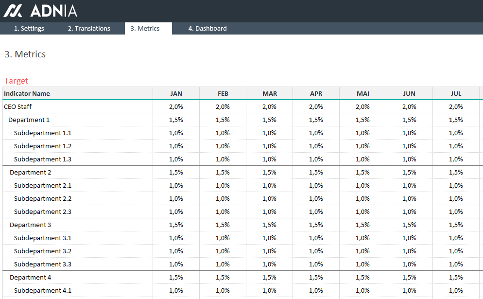
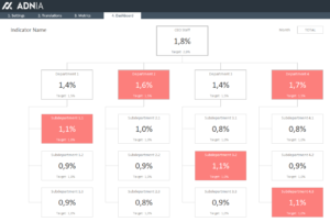
An organization chart is a diagram that represents the formal structure of an organization and the relationships and hierarchy between different positions in a company. The Organizational Chart KPI Template is an Excel spreadsheet template that allows you to monitor key performance indicators by department.
With this Excel Premium Template, you can easily visualize which departments are not reaching established goals and quickly identify improvement points. Use our professional charts to recognize outstanding departments and teams.
Key Features
- Simple solution to manage and visualize key performance indicators by department
- Easily build your own visual boards using our charts
- Communicate to everyone what performance measures are in place
- Identify the strengths and weaknesses of each department
- View all departments in one template
Simple and Professional
- Password included to unlock the template
- Spreadsheets ready for printing without Adnia logo
- No monthly fees
- Immediate download
- Secure payment with PayPal (no PayPal account needed)
What is included?
- One template with sample data
- One template ready to receive your data
- A text file with the password to unlock the template
- Estimated Delivery : Up to 4 business days
- Free Shipping & Returns : On all orders over $200
How it works:
Other Information
- Built for Excel 2010 or later
- Licensed for Private Use Only (not for distribution or resale)
The template may NOT be sold, distributed, published to an online gallery, hosted on a website, or placed on any server in a way that makes it available to the general public.
Help & Support
5 reviews for Organizational Chart KPI Template
5.00 out of 5 stars
Add a review
Related products
-
Adnia KPI Management Template 2
Original price was: $45.$25Current price is: $25. -
-

-
Annual Report Template Excel
Original price was: $35.$29.40Current price is: $29.40. -
Reyansh Saxena –
It helped clear up a lot of confusion around team structure and responsibilities. Seeing the org chart alongside the KPIs made it easier to understand who owns what and where performance conversations needed to happen.
Colin Matthews –
This gave us a much clearer picture of how our teams were performing. We were up and running pretty quickly, and it didn't need much adjusting.
Ananya Deshmukh –
Our management meetings are more useful now because the team structure and performance numbers are connected in one view. It’s helped us understand responsibilities better and see where certain departments may need more support.
Brandon Lewis –
What I like most is that I can see every department in one view. It's much easier to spot who's on target and who needs attention without digging through different reports.
Aurelia Hawthorne –
We finally have every department’s KPIs in one place. Comparing results across sales, operations, finance, and HR is much easier than working through separate spreadsheets.